Facebook Cover Photo Do’s & Don’ts


Taking up some major real estate, your Facebook cover photo is often the first thing a visitor sees when looking at your page. Actually, it takes up a quarter of the screen on most desktops. That’s some serious space! It also uses the most room of any image on your profile – but getting it right can be tricky. From sizing up the right image, to making sure nothing is covered up, here are the do’s and don’ts for selecting a perfect cover image.
Do #1: Make Sure The Size Is Right
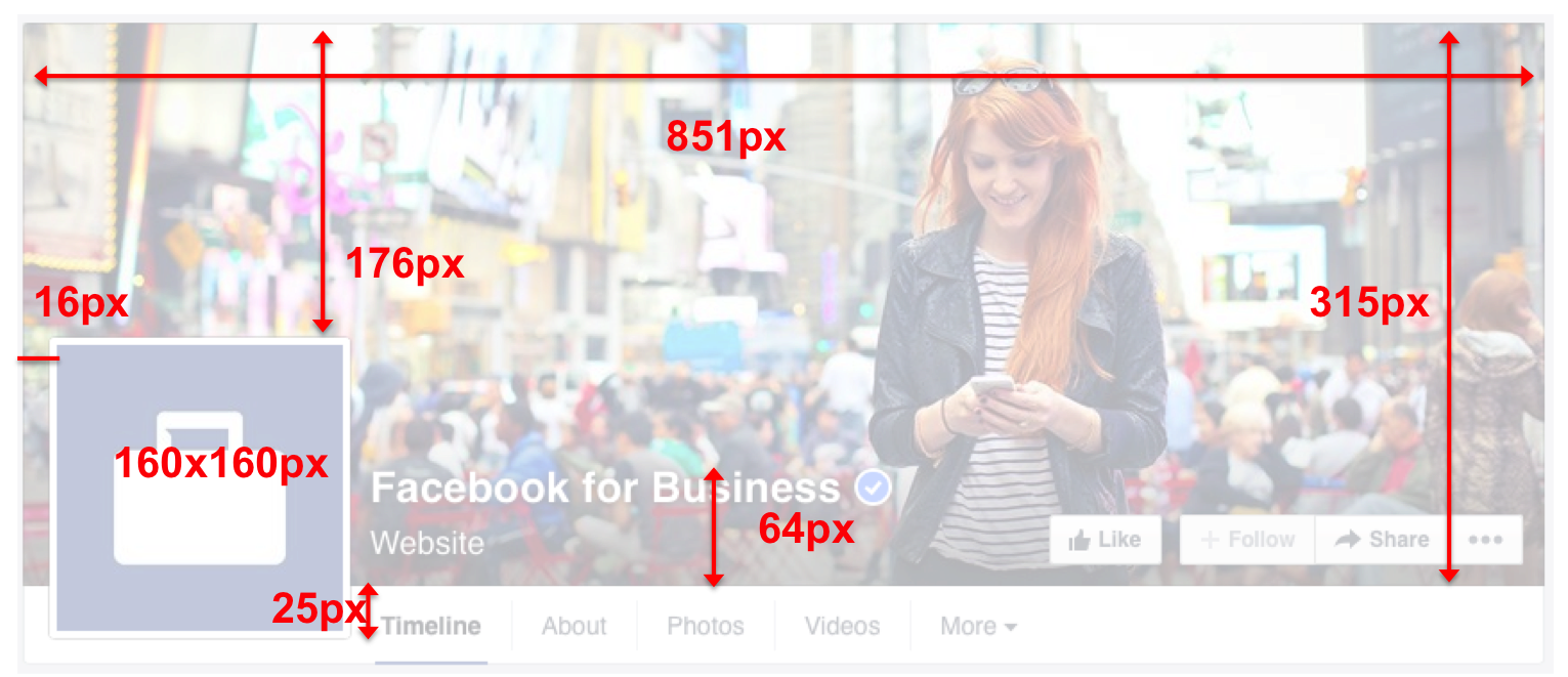
Social media just loves to be inconsistent with one another. Every platform has a different size limit, and some are more inclusive than others. For Facebook, their cover photo has been the same for a while, and the basic dimensions are 851 pixels wide by 315 pixels tall. Most standard photo editing programs will show you the dimensions of your image in pixels so you’ll know how to crop your picture. If you upload a larger image, Facebook will allow you to select the portion of the picture you want to feature. However, uploading a smaller image will cause Facebook to stretch it to fit and it may distort your image. Anything smaller than 399 pixels wide and 150 pixels tall will not be uploaded.
Don’t #1: Don’t Hide Important Content Behind Your Profile Picture
The easy part is memorizing the pixel dimensions, what gets a bit more complicated is the layout of Facebook’s page. Your profile picture, while important, butts into the cover photo quite a bit. Be sure nothing important is hiding back there where your viewers can’t see it! If you have any text on your image, this is not the place for it to be. To understand this better, check out Facebook’s dimensions guide below. This shows you the length and width of everything in the cover photo area, so you can better plan your image.
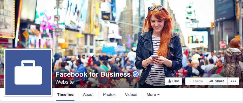
Do #2: Place Focus On The Right Side Of The Image
As your profile picture anchors the page on the left, its a good design practice to have something of interest in your cover photo on the right. You don’t have to take this too literally, but if you’re including a photo of your facility in the image – it would definitely appeal to the eye to have the building centered on the right side of the image. See Facebook’s example below. The main subject in their photo is toward the right side of the image, not competing with the profile picture on the left.
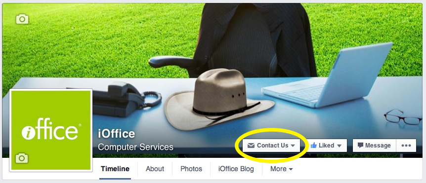
Don’t #2: Ignore Your Call-To-Action Button
Facebook recently released a CTA or “call-to-action” for business pages. It doesn’t really grab your attention, but it could potentially help you to reach out to tenants or people who want to learn more about your services! When you’re in Facebook, click on the small rectangular button to the right of your profile image and Facebook will guide you to customizing your text and where you want your viewers to go.
Do #3: Keep It Consistent
If you’re managing your facilities management company’s Facebook, Twitter and LinkedIn – you have the power to streamline the cover photos across all of the platforms. The images don’t have to be identical, but it helps first time viewers know immediately that they’re seeing the social pages for the same company. It also keeps everything conjoined and gives your social presence a cohesive element.
Now, if you’re only planning to participate on Facebook, make sure your cover photo includes your company’s name or building name, and uses either your traditional logo or something recognizable. If your facility is featured on your company website, try using the same image. It may seem obvious to you, but to a new user it just confirms they’re where they are supposed to be.
Don’t #3: Leave It Blank
This information can be overwhelming, especially for someone who doesn’t have much time to devote to managing a company Facebook page. Or if you’re a small facilities management company, you may think it doesn’t matter. Social’s importance can be argued either way, but once you commit, it’s important to go all in. Please don’t leave your cover photo blank. This will definitely drive viewers away and can make you appear lazy, which isn’t the message any facility wants to send!
Need some design inspiration? Check out HubSpot’s article, 25 ‘Boring’ Companies With Brilliant Social Media Cover Photos. Don’t miss #5! If you’re just starting out on Facebook, and this is a bit overwhelming, download our Social Media Guide For Facilities Managers. Also, if you have any feedback or questions please leave them in the comments below. Happy Facebooking!